Saw the new Chrome logo? 5 times company logos were massive fails

After 8 years, Google has decided to give Chrome a new logo. The logo has received a subtle design change and is barely noticeable. The 2022 logo has a bigger blue circle and a neater design when compared with the 2014 logo. The colours of the logo are now more deeper and vibrant. The 2022 version also doesn’t have shadows on the borders of each colour, making the logo look flat.

Elvin Hu, a designer for Google Chrome, shared the announcement on his Twitter. He tweeted about the new logo, "We also found that placing certain shades of green and red next to each other created an unpleasant colour vibration, so we introduced a very subtle gradient to the main icon to mitigate that, making the icon more accessible."
Some of you might have noticed a new icon in Chrome’s Canary update today. Yes! we’re refreshing Chrome’s brand icons for the first time in 8 years. The new icons will start to appear across your devices soon. pic.twitter.com/aaaRRzFLI1
— Elvin ? (@elvin_not_11) February 4, 2022
He also asked for feedback on the post, and as you can imagine, Twitter stepped up. Users expressed their thoughts on the negligible changes made in the logo. Safe to say, people were not happy.
Chrome: We changed our logo! Me: pic.twitter.com/PhX1nxS9Vm
— DraglineDrummer (@DraglineDrummer) February 7, 2022
Google chrome changes its logo after 8 years pic.twitter.com/mUPjKFQxEP
— SwatKat? (@swatic12) February 6, 2022
But this isn't the first time a brand has updated their logo and left users mind-boggled.
Here are 5 other times logos were a massive fail for these companies:
1. MYNTRA FACES A LAWSUIT
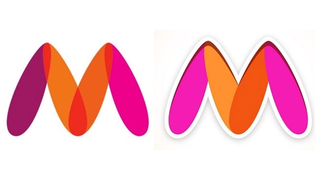
In February 2021, Myntra released a new logo after a Mumbai-based activist registered a complaint against it. To the normal eye, the logo seemed to be the alphabet ‘M’ with different shades of pink and orange, but to activist Naaz Patel who is also the founder-director of Avesta Foundation, the logo seemed to be obscene.

The complaint stated that the placement of the colour scheme depicted a woman’s vagina. Specifically, the dark orange center could be interpretated as a woman spreading her legs in a suggestive manner. Myntra was forced to change the colour scheme to avoid facing legal action.
2. AMAZON SMILES LIKE HITLER
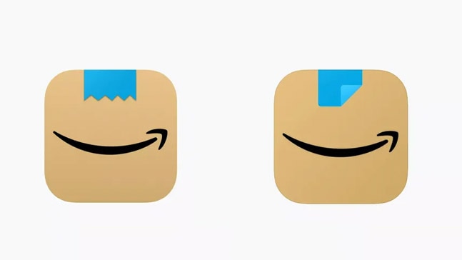
Amazon updated its logo with a strip of blue tape over its existing arrow. The blue tape was meant to represent the Amazon packaging tape and the arrow was meant to represent the brand's super-fast delivery service. But instead, some observers said that the logo resembled a toothbrush moustache, long associated with Adolf Hitler. The change took place in January 2021.

One customer said, "It’s not just a ripped Scotch tape, it’s a ripped Scotch tape that has a similar shape and is right on top of a smiling mouth - Looks like a happy little cardboard Adolf to me."
Amazon’s new app logo be lookin like they’re the THIRD most downloaded in the “Reich” section. pic.twitter.com/znvvfQ5nst
— Jon Prosser (@jon_prosser) January 26, 2021
Amazon changed the blue tape on its logo from being ripped to being folded.
3. CALENDLY'S TOILET RESEMBLANCE
Reportedly, Calendly spent about US $1.5 million on re-branding its logo but sadly, miserably, failed. Several Twitter users pointed out that the new 'C' just before the word Calendly seemed to be a toilet, if looked from a bird's eye view.
hold on.. calendly spent $1.5M on a new logo that looks like a bird’s-eye view of a toilet?lmao, fire whoever made that decision yesterday. pic.twitter.com/lYjW5o9c5J
— Jay ( ? , ? ) (@MisterJHuffman) June 14, 2021
Revealed in June 2021, the logo was trolled on social media by the public and graphic designers as well for the use of single colour throughout. The company has not yet made any changes to the logo.
4. META COPIES FROM GERMAN COMPANY
A German company named M-sense Migräne tweeted in October 2021 that Facebook's new parent company, Meta, has taken "inspiration" from them for their logo. The company wrote, "We are very honoured that Facebook felt inspired by the logo of our migraine app - maybe they’ll get inspired by our data privacy procedures as well."
We are very honoured that @facebook felt inspired by the logo of our migraine app - maybe they’ll get inspired by our data privacy procedures as well ? ? #dataprivacy #meta #facebook pic.twitter.com/QY7cota36r
— M-sense Migräne (@msense_app) October 29, 2021
Many jumped on board to lash out at Meta Man Mark Zuckerberg. One user tweeted, "One can fix the migraine the other is going to give me."
Here is what another user tweeted:
Good morning everyone, especially to the person at @msense_app who collected Zuckerberg’s entire soul, crushed it, and delivered it to LinkedIn pic.twitter.com/U0hcAMdMo6
— Liam Kent ?❄️ (@Liam__Kent) November 1, 2021
Meta has not responded to the claim and M-sense clarified on Twitter that they will not be pressing charges against Meta.
5. UBER LOSES THE U
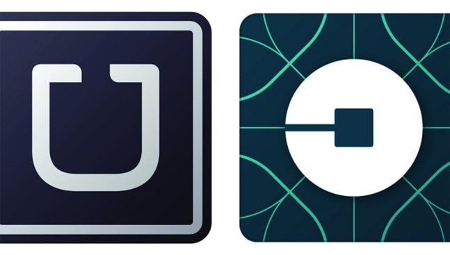
Back in February 2016, Uber experimented and released a new logo and removed its signature 'U' from its homepage icon. Uber co-founder and CEO Travis Kalanick explained the change in a blog post. He wrote that the company new logo type was more 'grounded and elevated'. The CEO also said in that with the addition of colour and patterns, the 'atom' of Uber would now bring the human side of it to life.

Twitter exploded talking about the change in Uber's logo and most weren't happy, with some saying that it would nearly be impossible to recognise the Uber app when returning home drunk and that the new logo was underwhelming and disgusting.
Currently, the company's homepage icon features Uber written with white ink on a black background.
Which one of these did you hate the most?

